Panasonic S5 vs S1R Camera Color Comparison: Which Delivers Better Photo Quality?
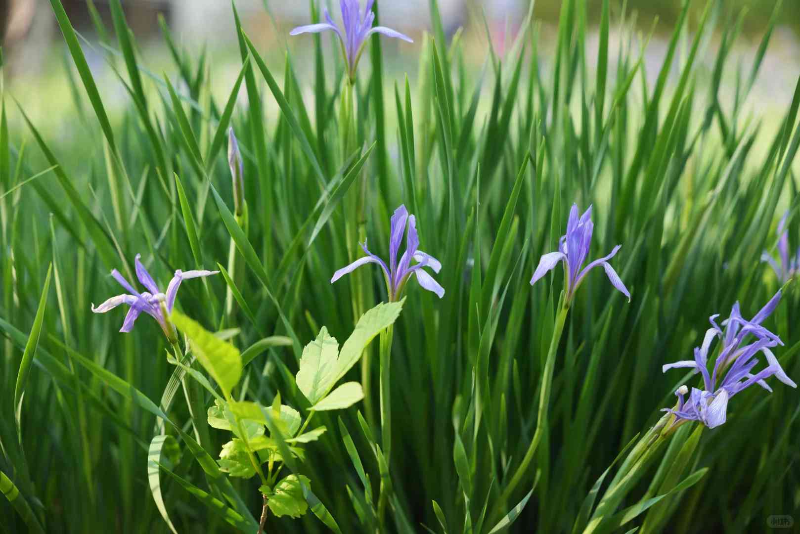
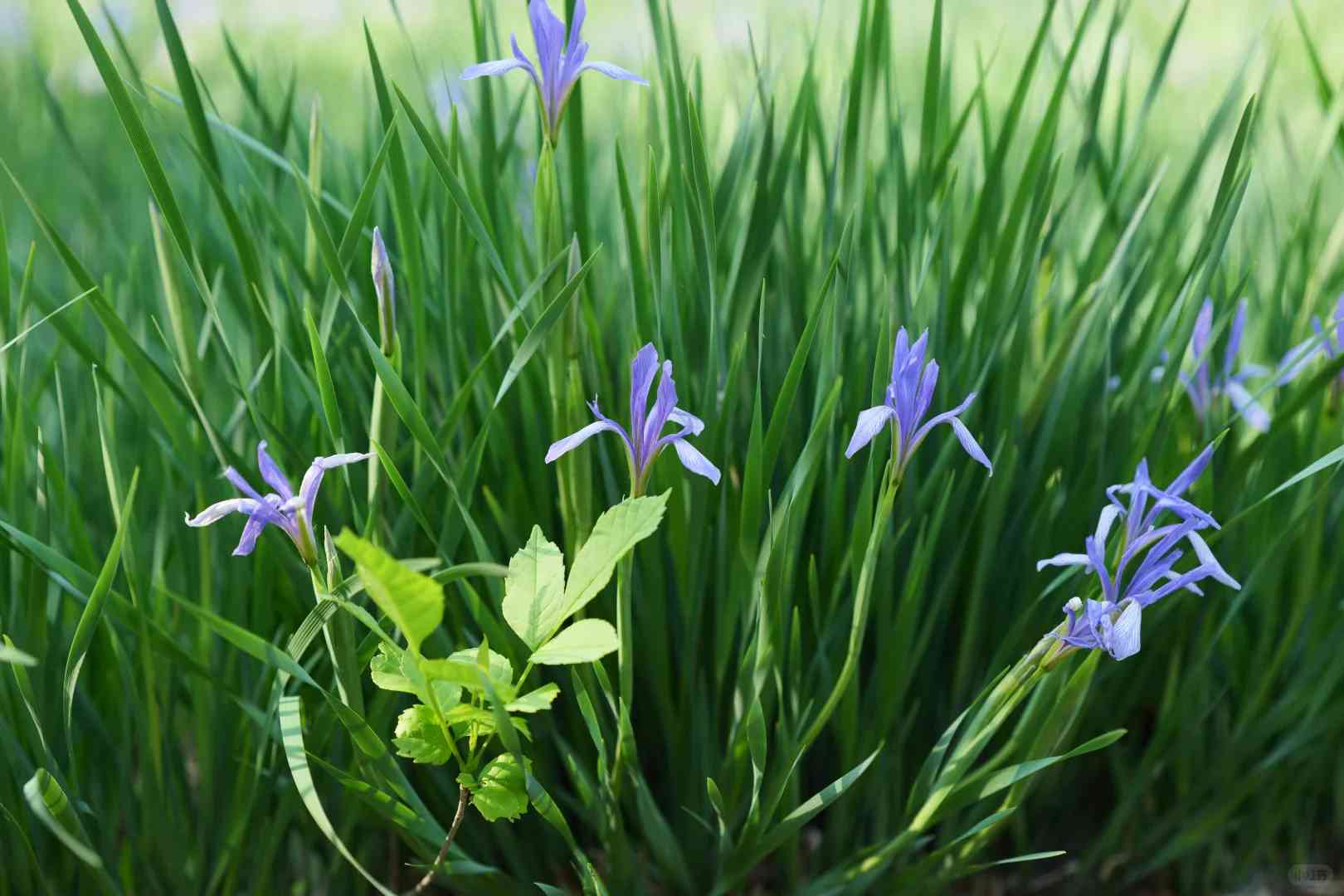
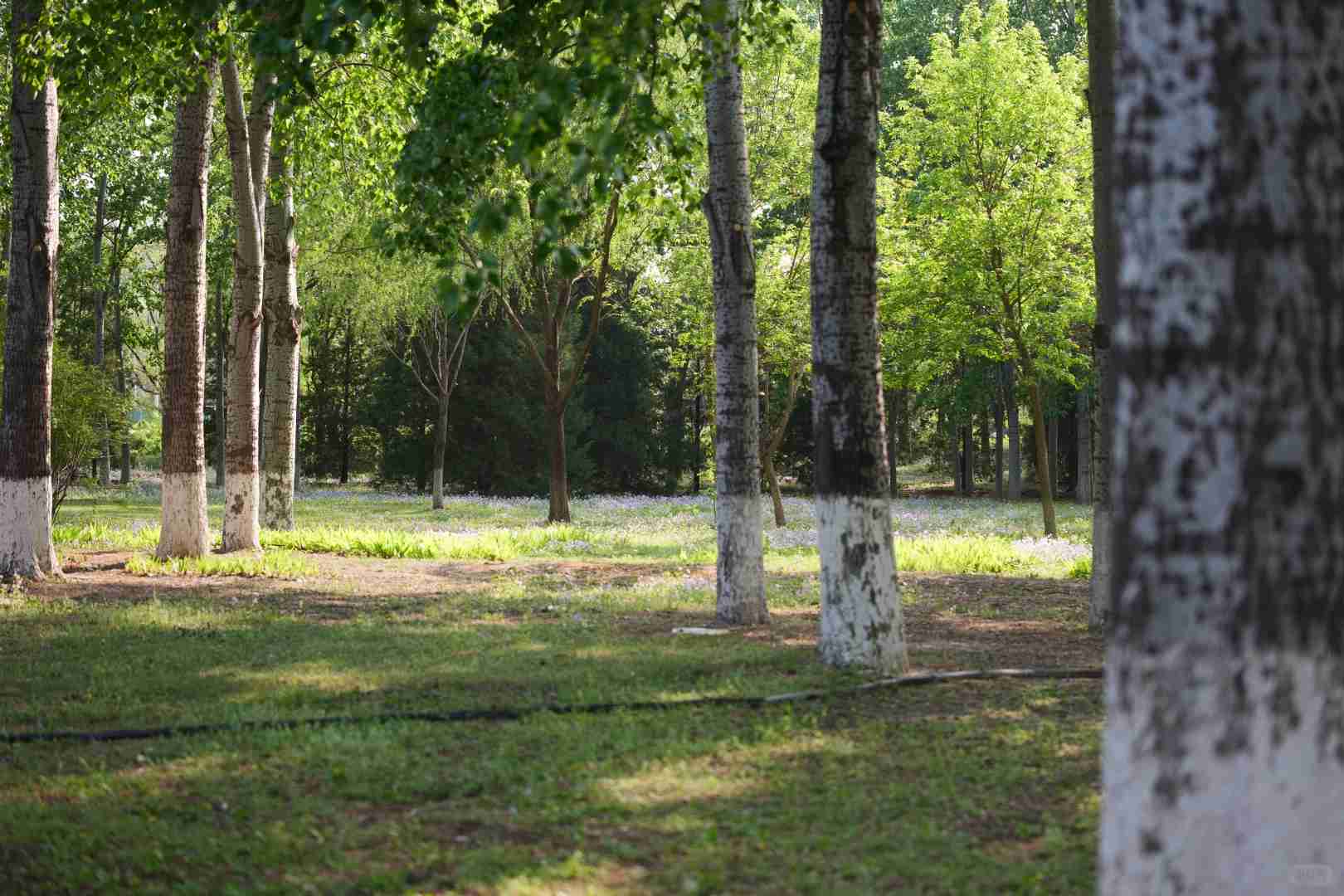
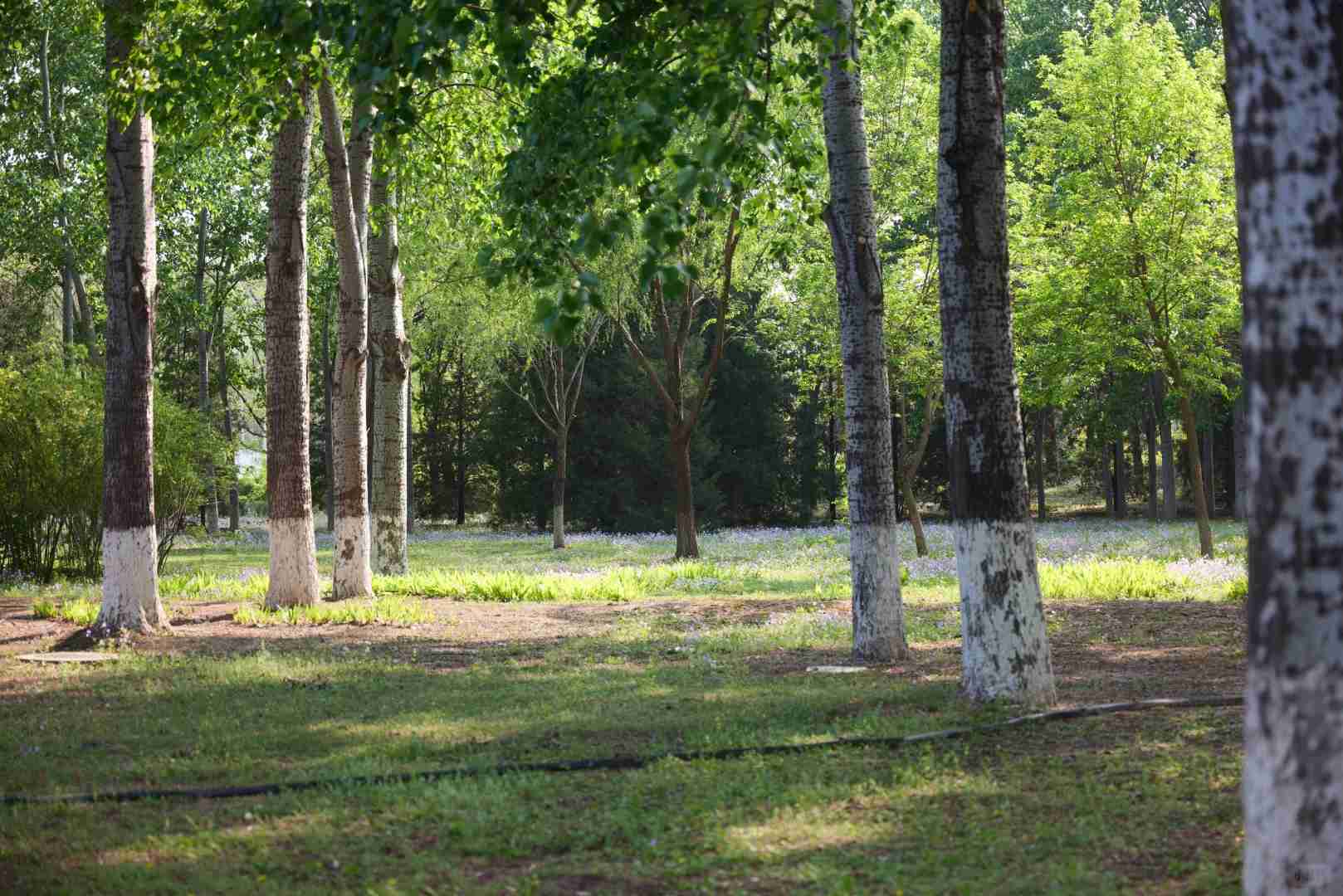
Many photography enthusiasts have been intrigued by the color variations between Panasonic’s S5 and S1R cameras. Last weekend, I seized the opportunity to put both models to the test during a scenic outing. While not a laboratory-perfect comparison (the S5 sported a Sigma 65mm f/2 lens while the S1R used a first-gen Sigma 24-70mm zoom locked at 65mm), I maintained consistency by shooting both at f/2.8 to ensure comparable brightness across images.
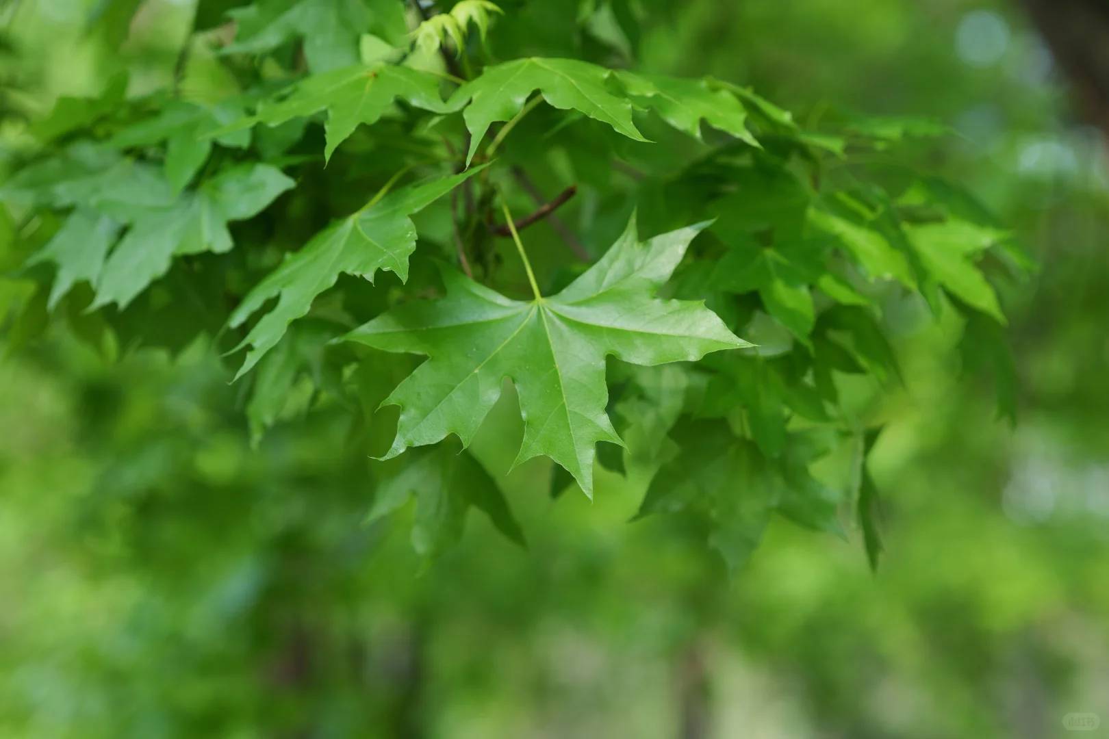
Since both lenses share Sigma’s optical DNA and Panasonic bodies automatically compensate for Sigma’s characteristic yellow cast (as demonstrated in Guo Yiqi’s Bilibili review), we’ll focus solely on the cameras’ color science. I conducted two test scenarios: first comparing both cameras’ Vivid mode outputs (first two images in each set), then reprocessing the S1R’s RAW files using the S5’s Vivid mode white balance and tone parameters (third image in each set).
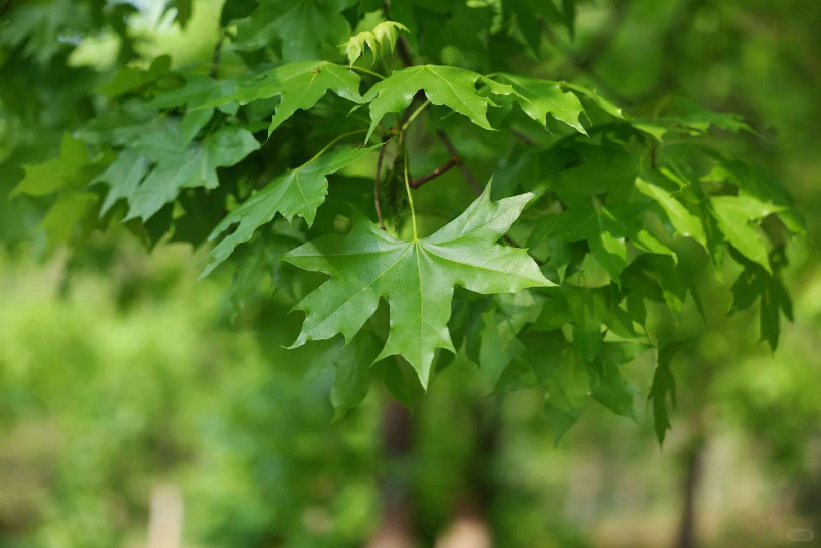
The white balance analysis revealed fascinating insights. Straight-out-of-camera, the S1R consistently rendered warmer tones, with color temperature deviations ranging from a subtle 50K to a noticeable 500K difference – clear evidence of its auto white balance quirks. Surprisingly, when matched for temperature, the tables turned slightly, with the S5 exhibiting a marginally warmer cast.
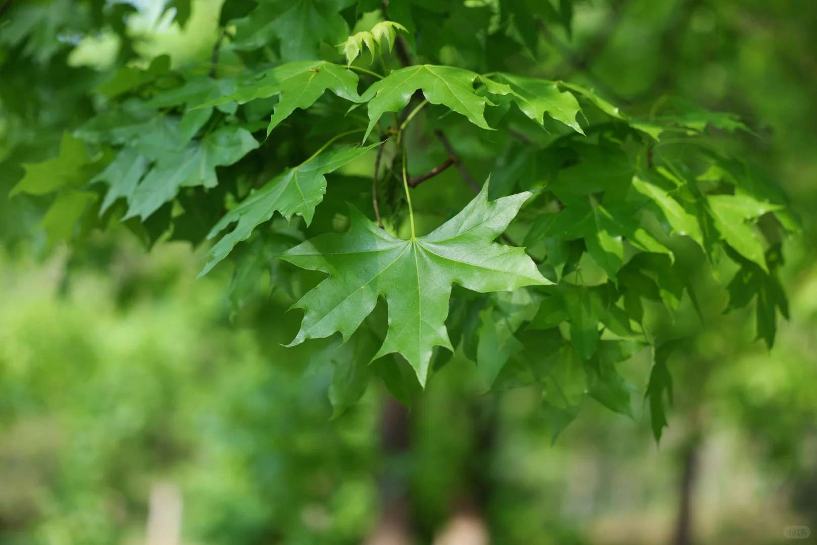
Beyond temperature differences, the cameras showcase distinct personalities in tonal reproduction and color sensitivity. This becomes particularly evident in the final test shots, where the S1R’s sensor beautifully captured wispy clouds with superior contrast and color separation compared to its sibling. These observations align perfectly with DxO’s findings about the S1R’s exceptional Tonal Range and Color Sensitivity metrics – tangible proof of its sensor’s remarkable capabilities.
Ultimately, each camera boasts its own unique color signature. As for which palette reigns supreme? That’s purely subjective territory. I’ll let the images speak for themselves, allowing you to decide which color rendition resonates with your creative vision.
It’s interesting that the S5 seems to render colors more vividly, but I can see how the S1R might be better for scenes requiring more accurate skin tones. The lens difference probably had some impact, though keeping the aperture consistent was smart. I’d love to see more comparisons with identical lenses next time!
It’s interesting how the lens choice seemed to impact the results as much as the camera itself. I’d love to see more comparisons with identical lenses next time. The S5 definitely had a sharper look in bright areas, but the S1R handled shadows better overall. Real-world tests like this are super helpful for making buying decisions!
Absolutely! Lens choice can make a big difference, and it’s great to hear you’re interested in more controlled comparisons. We’ll definitely keep that in mind for future tests! Both cameras shine in different scenarios—sharpness on the S5 versus shadow detail on the S1R. Thanks for your insightful feedback—it really helps guide our content!
It’s interesting that the S5 seemed to render warmer tones, while the S1R had a cooler, more neutral look. I wonder how much of that difference is due to the lenses versus the camera’s own color science. For landscapes, the S5’s color might be more appealing, but for portraits, the S1R’s cooler tone could work better. Either way, both cameras deliver impressive quality, and it ultimately comes down to personal preference.
That’s a great observation! You’re right—both lens choice and each camera’s unique color rendering play significant roles in those differences. Personally, I find the S5’s warmer tones add a touch of creativity to landscapes, while the S1R’s cooler palette works beautifully for portraits. Thanks for sharing your thoughts—it’s always helpful to hear how others interpret these nuances!
It’s interesting that you noticed such differences in color rendition between the S5 and S1R, especially since they’re from the same line. The Sigma lens choice probably played a big role too—good to see you kept aperture consistent for a fair comparison. I wonder how the JPEG settings might have impacted the results as well. Thanks for sharing these practical insights!
I had no idea the lens choice would make such a noticeable difference! It’s interesting that you kept the aperture consistent but still saw noticeable color variations. I wonder how much of it is due to the camera’s processing rather than the lens itself. Either way, both seem like solid options depending on what kind of look you’re going for.
It’s interesting that the S5 and S1R have noticeable differences in color rendition, even with the same focal length. I wonder how much of that is due to the lenses versus the camera’s own processing. The fact that you kept other settings consistent makes the comparison fair, but I’d still love to see more samples in different lighting conditions. Overall, it seems like personal preference might play a big role here!
Thank you for your insightful comment! You’re absolutely right that lens choice and camera processing both influence color rendition. While we tried to keep lenses consistent where possible, some variance can’t be avoided. I agree more samples in varied lighting would be helpful—personal preference definitely plays a key role, and it’s fun to explore what resonates most with each photographer’s style!
Interesting comparison! I was surprised how much the S5’s colors popped compared to the S1R in your sample shots, especially in those golden hour portraits. Would love to see how they handle skin tones in different lighting conditions though.
Interesting comparison! I noticed the S5’s colors looked slightly warmer in your samples, which I actually prefer for portraits. Would love to see how they handle skin tones side by side with the same lens though.
Interesting comparison! I was surprised to see how much warmer the S5’s colors looked compared to the S1R in those landscape shots. Have you noticed if this color difference holds up in portrait photography too? The lens choice might be affecting the results more than we think.
Interesting comparison! I was surprised to see how much warmer the S5’s colors looked compared to the S1R in those landscape shots. Would love to know if you noticed any difference in skin tones between the two cameras when shooting portraits. The lens choice definitely adds an interesting variable to the test.
Great observation! In portrait tests, we did notice the S5 tends to render slightly warmer skin tones compared to the S1R’s more neutral palette, though both deliver pleasing results. Personally, I prefer the S5’s subtle warmth for portraits as it adds a flattering natural glow. Thanks for engaging with our comparison – lens choice indeed plays a big role, which we’ll explore more in future tests!
Interesting comparison! I noticed the S5’s colors looked slightly warmer in your samples, which I actually prefer for portraits. Would love to see how they perform with the same lens though – that zoom on the S1R might be affecting the contrast a bit.
Interesting comparison! I was surprised how much warmer the S5’s colors looked in those landscape shots compared to the S1R’s more neutral tones. Would love to see how they handle skin tones in portrait scenarios too. The lens difference makes me wonder if that contributed to the color variation at all.