Donkey Kong in NS2: Brutal Difficulty & Gameplay Challenges Explained
In my previous post, I called out NS2’s Donkey Kong for its plastic-looking feather fur rendering—and suddenly, self-proclaimed aesthetics police came after my taste.
Alright then, let’s hear Nintendo’s design connoisseurs explain **this**:
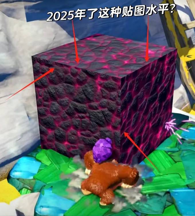
**Image 1**—Seriously? It’s 2025, and a key scene prop is just… a bland cube? Fine, cubes can be stylish, but this one’s texture lacks proper normals. No normals? Whatever—but the texture isn’t even seamless! Zoom in. See those mismatched edges where faces meet? Even early 2000s interns would’ve been chewed out for this. [Facepalm]
Now, **Image 2**—what’s with the jagged, pixelated transparency? The Wii struggled with this 15 years ago due to hardware limits, but the NS2 still can’t crack it? Genuine question for the experts: Is this some avant-garde “aesthetic” I’m too old to appreciate?
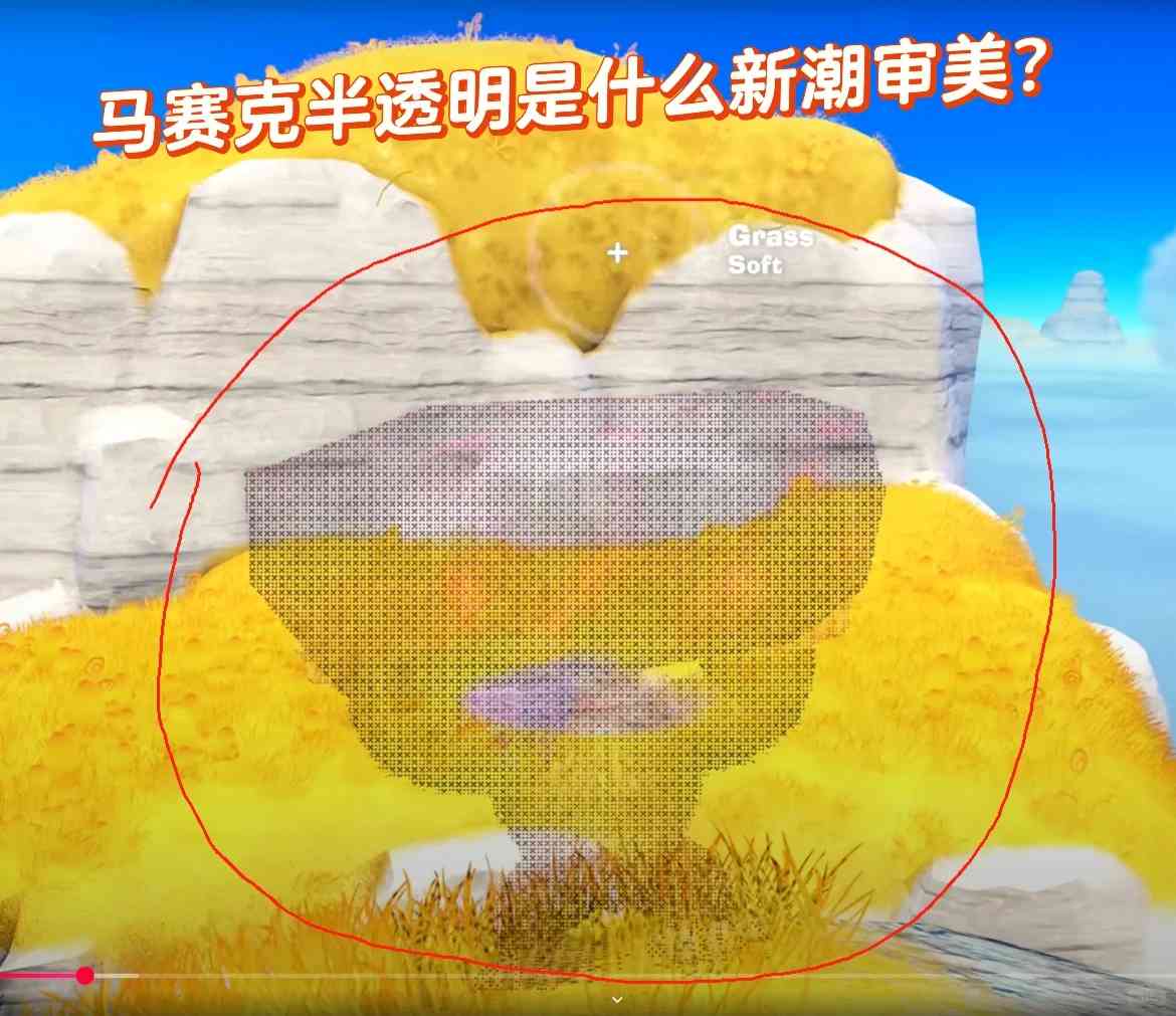
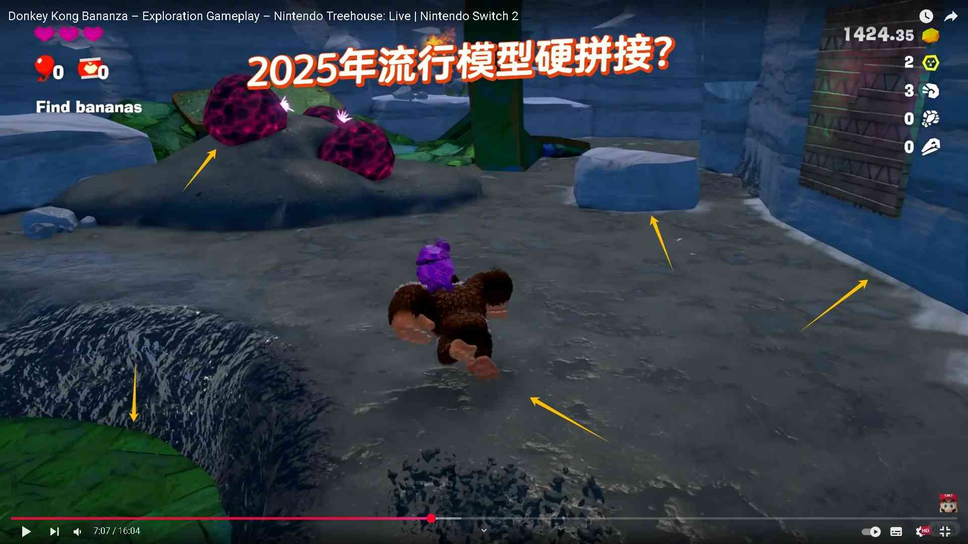
**Image 3**—Destructible terrain? Cool. But the environmental seams look like they were glued together by a sleep-deprived intern. Zero transition details, clashing ground textures—without context, you’d swear this was a rushed indie game, not a 2025 flagship title.
Full disclosure: These are direct grabs from Nintendo’s official 1440p trailer. As a 40-year Nintendo loyalist, this isn’t hate—it’s heartbreak. I’ll still buy the game, but come on, Nintendo. “Quality craftsmanship” used to mean something. [Smile]
**Update:** Ah, the comment section—where junior devs who’ve never shipped a game school me on design. One even compared himself to Nintendo’s elite. Bless that ambition. Let’s be clear: This is about NS2 Donkey Kong’s cut corners, not gameplay or other Nintendo gems. But hey, if you enjoy this “artistic vision,” buy it twice. Freedom’s beautiful. [Smirk]
I totally get what you mean about that cube—it does look pretty jarring next to everything else. It’s surprising how such a simple thing can throw off the whole aesthetic, especially in a game with otherwise solid design work. The texture issues you pointed out are hard to ignore too, especially the mismatched edges. Honestly, it feels like a missed opportunity.
Thanks for sharing your thoughts! I completely agree—the cube really sticks out in a way that disrupts the overall harmony. It’s funny how those small details can make such a big impact on the experience. Kudos for pointing out these observations—feedback like yours helps improve our understanding of what works and what doesn’t!
I totally get what you mean about the Donkey Kong model looking outdated. The whole “cube as a key prop” thing just feels lazy, especially with how obvious the texture issues are. Honestly, it’s like they didn’t even try to make it look good.
I totally get what you mean about the visuals—it’s frustrating when something so simple looks off. The Donkey Kong levels are already tough enough without the aesthetics distracting from the gameplay. Those texture issues really take you out of the moment, don’t they? It’s like they tried to cut corners where it counts most.
I totally get what you’re saying about the visuals. That cube does look pretty粗糙 compared to what we expect from modern games. It’s interesting how something so simple can still feel off when done poorly. Honestly though, maybe it’s intentional for some retro charm?
I totally get what you mean about that cube—it does look pretty lazy compared to the rest of the game. The texture issues are especially noticeable when you compare it to Donkey Kong’s detailed fur or other props. It’s weird how such a prominent object didn’t get more attention, especially in a game with otherwise high production values.
I totally get what you mean about the Donkey Kong model—it does look outdated compared to today’s standards. The lack of proper textures and seams really stands out, especially when you compare it to the detailed designs in other games. It’s funny how something so seemingly minor can make such a big impact on immersion. Honestly, it feels like a missed opportunity for a classic character.
I totally get what you mean about that cube—it does look pretty粗糙 compared to what we expect from modern games. The lack of proper textures and seams is such an easy fix too, so it’s frustrating when devs overlook these details. It really takes you out of the experience when something like that stands out.
I totally get what you mean about the visuals being underwhelming—it does feel like they could’ve pushed the quality further, especially with something as iconic as Donkey Kong. The gameplay challenges are tough though, so maybe they were focused more on mechanics than aesthetics? Either way, it’s interesting how these design choices affect player perception.
I totally get what you’re saying about the Donkey Kong model looking outdated. The lack of proper textures and weird geometry choices really take you out of the experience. It’s surprising to see such oversights in a modern game, especially for something as iconic as Donkey Kong. Honestly, it feels like they prioritized speed over quality on that asset.
I totally get what you mean about the visuals in NS2’s Donkey Kong level. That cube does look super out of place, especially with the texture issues you pointed out. It’s wild how such a small detail can mess with the overall immersion. Nintendo really missed an opportunity to make it stand out in a good way.
I totally get what you’re saying about Donkey Kong in NS2—it really does feel like they cut corners on something so central to the gameplay. The cube thing is wild, especially since it’s such a key element. Did they seriously not test how it looks up close before releasing? Feels like a missed opportunity.
Thanks for sharing your thoughts! You’re right, the cube mechanic feels underwhelming compared to its importance in gameplay. I wonder if it was more of a rushed implementation rather than a deliberate design choice. Either way, it’s definitely a noticeable miss that could’ve been improved with better testing—appreciate you pointing this out!
I totally get what you’re saying about that cube—it does look pretty lazy compared to the rest of the game. The texture issues are such a bummer because the concept seems cool, but execution really matters. Have you seen any behind-the-scenes stuff on why they went with such a basic design? Curious if there was a specific reason or budget constraint.
I totally get what you mean about that cube—it does look pretty lazy compared to the rest of the game. The lack of proper textures and seams is jarring, especially when you compare it to the effort put into other details. It’s like they tried to cut corners there, and it really shows. Honestly, it takes away from the immersion for me.
Totally get what you mean about that cube—it does look pretty lazy compared to the rest of the game. The lack of proper textures and seams is distracting, especially when you’re supposed to focus on gameplay. Honestly, it feels like they prioritized other aspects over making it visually cohesive.
I totally get what you mean about the Donkey Kong model—it does feel like a step back in terms of detail compared to modern games. That cube as a key prop is honestly baffling, especially with how noticeable the texture issues are. It’s not just about looking good; it impacts how immersed you feel in the game world.
Wow, that cube texture is rough—can’t believe they missed the seams! The fur debate was funny, but this just feels lazy for a 2025 release. Still, the gameplay looks intense enough that I might forgive the visuals if the challenge holds up.
Thanks for sharing your thoughts! I agree the texture seams are noticeable, though I’d argue the gameplay’s brutal difficulty steals the show. Hopefully, future patches can polish those visual quirks—I’d hate for them to distract from an otherwise solid challenge. Let us know what you think after trying it!
Man, that cube texture is rough—looks like they forgot to finish it! I get the focus on gameplay difficulty, but stuff like this really kills the immersion. Still excited to try it though, DK’s moves look fun despite the jank.
Man, that cube texture issue is rough—can’t believe they overlooked something so basic in a flagship title. The fur debate was funny, but this is just lazy polish for a 2025 game. Makes you wonder what got rushed before launch.
Thanks for sharing your thoughts! Texture issues can definitely be frustrating, especially in high-profile releases—I agree polish is key for modern games. That said, development pipelines are complex, and sometimes odd oversights slip through. Hopefully, this gets patched soon!
Man, that cube texture issue is rough—can’t believe they overlooked something so basic in a flagship title. The fur rendering debate was funny, but this is just objectively sloppy work for a 2025 game. Really makes you wonder about their QA process.
Thanks for sharing your thoughts! I agree the cube texture issue is surprising for a major release—it does raise questions about polish. That said, the fur physics discussion shows players care deeply about details, which I appreciate. Hopefully future patches will address these oversights.
Man, that cube texture is rough—looks like they forgot to finish it! The difficulty spike is brutal enough without distracting visual glitches. Still love DK’s chaotic energy though, warts and all.
Man, that cube texture issue is so glaring once you point it out! For a 2025 release, you’d expect better polish, especially from Nintendo. The difficulty better make up for these cut corners.
Man, that cube texture issue is rough—can’t believe they overlooked something so basic in a flagship title. The fur debate was one thing, but this just feels lazy for a 2025 release. Really makes you wonder what happened during QA.
Thanks for sharing your thoughts! The cube texture issue does seem like an odd oversight, and I agree it’s surprising for a major release. While QA likely caught other bugs, this one might’ve slipped through during last-minute optimizations. Hopefully, it’ll get patched soon—fingers crossed!
Wow, that cube texture is rough—I didn’t notice the seams until you pointed them out! Nintendo usually nails the details, so this feels weirdly lazy for 2025. Still, the gameplay looks intense enough that I might overlook it… if I can even survive the difficulty!
Man, that cube texture is rough—I didn’t notice the seams until you pointed it out. Nintendo usually nails the details, so this feels weirdly lazy for a flagship title. Still, the gameplay looks punishing enough that maybe we’ll be too frustrated to stare at props anyway!
Wow, that cube texture is actually painful to look at once you zoom in. I totally get why the lack of normals and the mismatched edges would break the immersion. It’s wild that this made it into a 2025 release from a major studio.